

CSS, after all, is not all that easy as speculated by many, especially when it comes to positioning elements on the browser. Flexbox a method can be easy at the same time be very frustrating. It was introduced majorly in 2009 because of the need to build displays for mobile phones, tablets and various screen sizes we have today.
Flex looks easy on taking a glance at it, but without proper understanding, you might see flex messing you up as it is doing to me right now. So in this article, we will be working through the process of using flex to achieve a website landing page.
A website landing page will have a navbar, a set of arranged elements in a row, and a footer. We will be using html5 tags and also our website will have to be fully responsive across all screen sizes.
In this article we will be focusing on the navbar, not the full website in that way we can get a quick headstart.

One of the most important things about Flexbox is the arrangement/structure of the HTML, the arrangement is very very important as the flex attribute is mainly applied from the parents to the children, and a proper arrangement can help in easy application of your flex.
Lets layout our website navbar using flexbox:
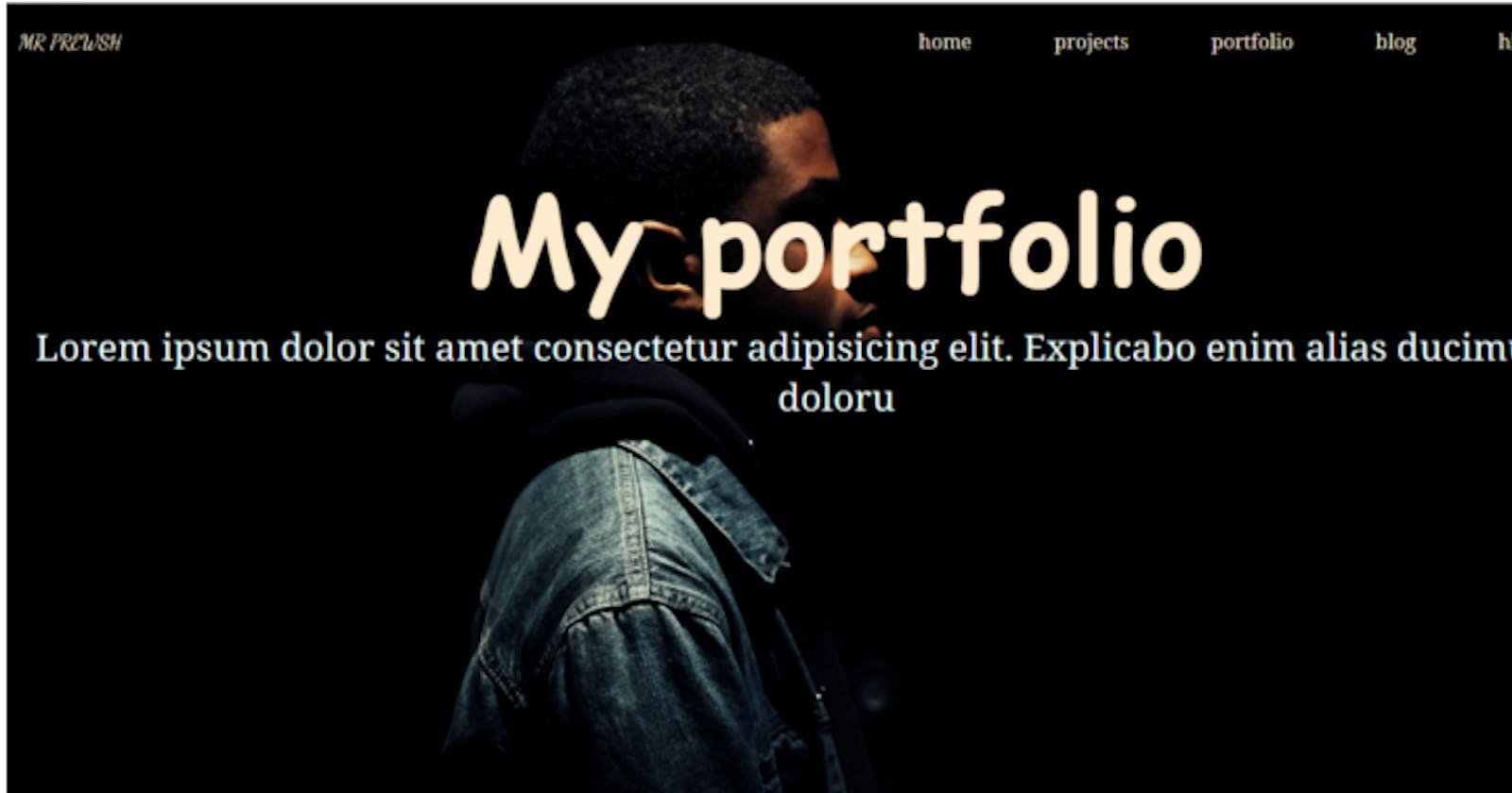
MR PREWSH
home
projects
portfolio
blog
hire me
The layout above is going to form the basic layout in HTML and I also want you to observe the use of header and ul tag. This will make our website SEO friendly.
The nav and the ul tags are some of the html5 tags.
Let’s go to the CSS folder and add some styles to our HTML so that the structure can make more sense.
The CSS styling:
.header{
list-style: none;
display: flex;
flex-wrap: wrap;
justify-content: space-evenly;
align-items: baseline;
background: transparent;
height: 50px;
padding: 10px;
color: antiquewhite;
}
The list-style: none; removes the style on the unordered (ul) list the display: flex; is just like a way to activate the flex on the parent container which is .header then the flex-wrap activates wrap on it.
The justify-content: space-evenly; makes the 2child Divs inside the parent to be placed side by side.

Don’t worry about the list-style: none; we will fix it later, so this is how our website will look at this time. So we keep styling, The next thing to fix is the second part of the child Div to achieve that we will make the div a parent div, we gave it a class name contact and we style the contact this way.
.contacts ul {
display: flex;
list-style-type: none;
flex-wrap: wrap;
justify-content: space-evenly;
}
So the contact class has a display flex, flex-wrap, and justify-content space evenly. These attributes make the contents of the contact class to be spaced within the box in a row. At this point, the list style type will make the dots to disappear and we have our navbar like this:

This time the left-hand side (contact class) are stacked together and so we need to specify the width it should so that it will occupy it.
This is the code below:
.header>div{
width: 50%;
margin-top: 10px;
}

Our navbar is set and spaced, using just flex and its attributes, there are so many other things that can be achieved with flex and you can go on to apply them in various places in placing elements on the browser.
Thank you for reading, for the full code this is the link https://github.com/prewsh/portfolioo to my GitHub repo and you can use this link https://prewsh.github.io/portfolioo/ to view the full website.